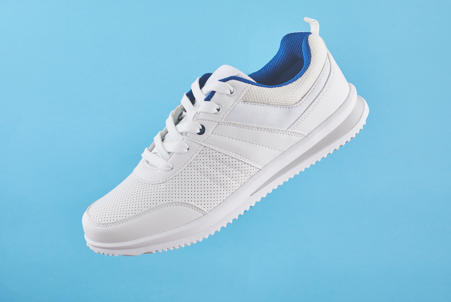
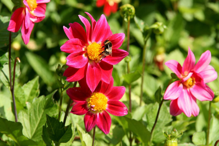
Floating Card
Card with 3D tilt, text-reveal and image focus effects on hover.

Installation
1. Run the following command in your terminal:
npx shadcn@latest add https://refinery.abhii.me/r/floating-card.jsonAPI Reference
| Name | Type | Description |
|---|---|---|
| image | string | The image to be displayed on the card. |
| name | string | The name or title to be displayed on the card. |
| description | string | A brief description or subtitle for the card. |
| index | number | The index of the card, used for staggered animation effects. |
| className | string | Additional CSS classes to apply to the card for custom styling. |
Usage Recommendations
Best for team profiles, feature cards, or product highlights.
If you do not want grayscale 0-100 transition on hover, you can remove that css filter from the image in the component file.
When installing shadcn, you can choose the 'nova' preset (lucide/geist) to match the intended typography.
Design Notes
I used motion values to map the pointer position into rotateX and rotateY, then softened that movement with springs. On hover, the card reveals the text overlay, accent lines, and vignette while the image scales slightly. The index prop drives the staggered entrance delay, so you can drop several cards into a grid and keep the motion feeling intentional.